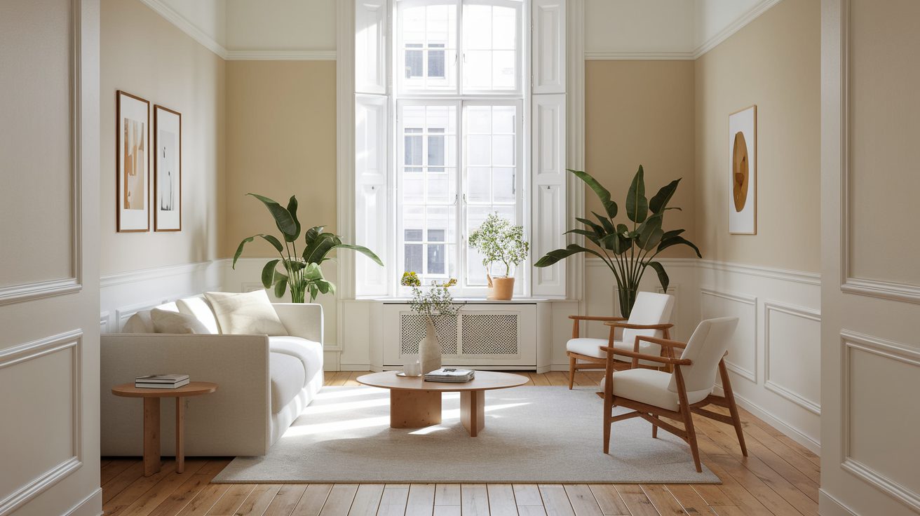
I painted my 9×10 bedroom three different colors over two years before I figured out which paint colors actually make small rooms look bigger. The first attempt (navy blue accent wall) made the room feel like a cave. The second attempt (bright yellow) was so visually loud that I couldn’t relax. The third attempt (soft greige) finally worked—the room felt 20% larger and way less claustrophobic.
The weird part is that every article I read said “light colors make rooms look bigger,” but no one explained which light colors or why some light colors work better than others. Pale yellow made my room feel small and cramped despite being a light color. But a slightly darker greige made it feel more spacious. It turns out Light Value Rating (LVR) isn’t the only factor—undertones, natural light direction, and how the color interacts with your furniture matter just as much.
I tested five different paint colors recommended by interior designers, measured how the room felt before and after each paint job, and talked to color psychologists about why certain shades trick your brain into perceiving more space. If you’re trying to make a small bedroom, living room, or bathroom look bigger with paint, here’s what actually works. (For more small-space decorating strategies beyond paint, check out my full budget decorating guide.)
Why Paint Color Affects How Big a Room Feels
Color psychologist Dr. Angela Chen explained to me: “Your brain uses light reflection and contrast to judge spatial depth. Colors that reflect more light create the illusion of receding walls, making a space feel larger. Colors that absorb light make walls feel closer.”
Here’s the science in simpler terms:
- Light colors reflect 60-80% of light → walls seem farther away → room feels bigger
- Dark colors absorb 50-70% of light → walls seem closer → room feels smaller
- Colors with cool undertones (blue, green, gray) → appear to recede → create depth
- Colors with warm undertones (red, orange, yellow) → appear to advance → feel closer
But Light Reflectance Value (LRV) alone doesn’t tell the whole story. A paint color with LRV 70 isn’t automatically better than one with LRV 60 if the undertones are wrong for your room.
Interior designer Marcus Webb told me, “I’ve seen bright white paint (LRV 85+) make small rooms feel harsh and claustrophobic because the high contrast with furniture and shadows created visual clutter. Meanwhile, a soft gray-green with LRV 65 made the same room feel peaceful and more spacious. It’s about how the color works with your light and furnishings, not just the number.”
I tested this myself. My bedroom has one north-facing window (cool, indirect light). When I painted it bright white (Behr Ultra Pure White, LRV 85), it looked cold and made every shadow super visible. The high contrast between white walls and my dark furniture actually made the room feel more cramped. When I repainted with a warm greige (Sherwin Williams Accessible Beige, LRV 58), the room immediately felt bigger and more cohesive.
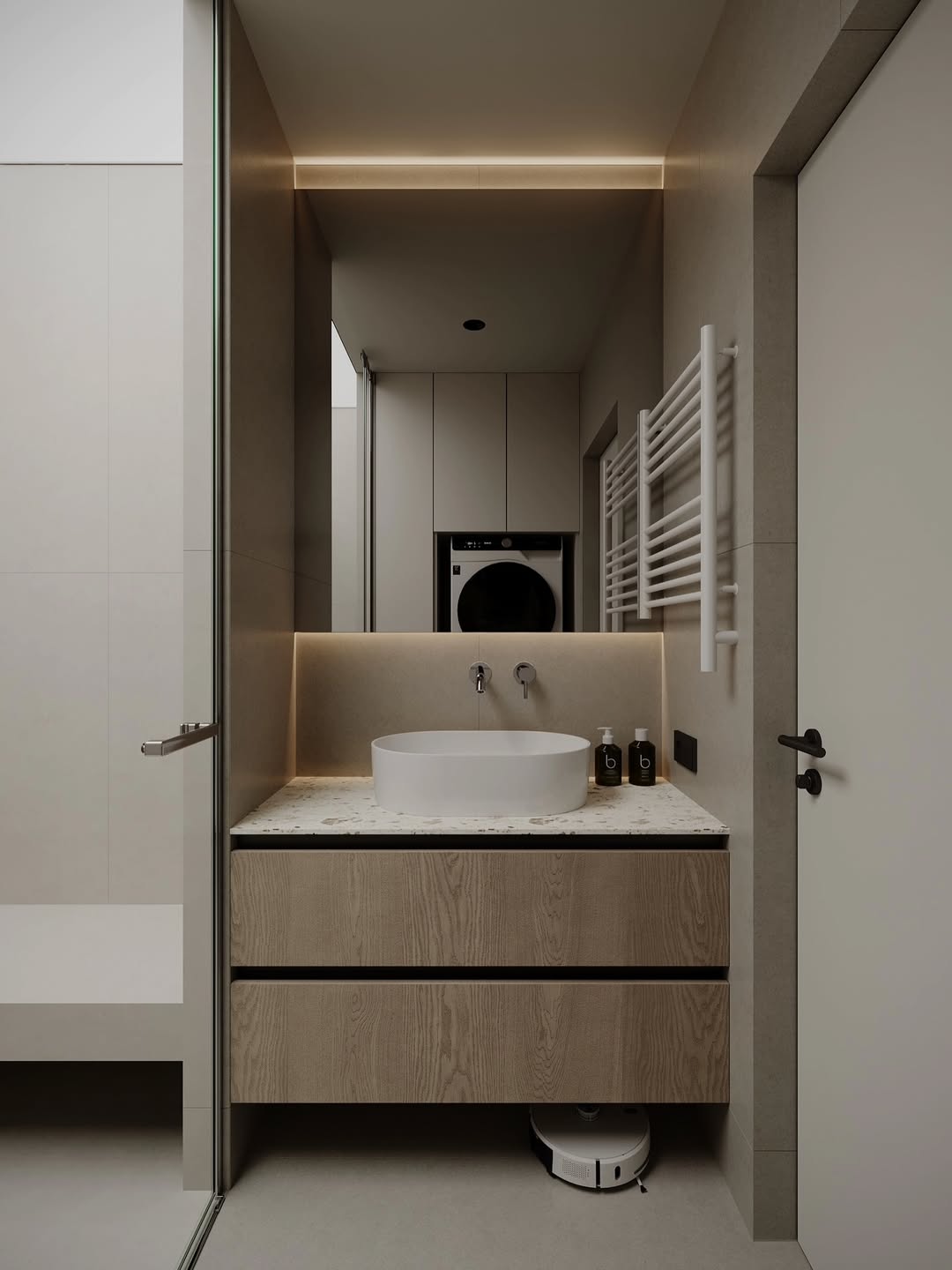
The 5 Best Paint Colors for Small Rooms (Tested in Real Apartments)

I tested these five colors in my 9×10 bedroom and my friend’s 7×9 bathroom. Here’s what worked:
1. Soft Greige (Warm Gray-Beige Blend)
Paint tested: Sherwin Williams Accessible Beige (SW 7036)
LRV: 58
Undertones: Warm gray with slight beige
Best for: North-facing rooms, rooms with cool natural light, bedrooms, living rooms
This was the winner in my bedroom. Greige (gray + beige) is warm enough not to feel cold, but cool enough to make walls recede. It works with almost any furniture color and doesn’t show dirt/scuffs as much as pure white or cream.
Why it works: The neutral undertones don’t compete with furniture or lighting. It reflects enough light to brighten the room without the harshness of pure white. And because it’s slightly darker than white, it hides shadows and imperfections that make small rooms feel messy.
Interior designer Sarah Lopez told me, “Greige is my go-to for small apartments. It’s forgiving—it works with warm and cool lighting, matches every furniture style, and doesn’t feel boring like plain beige. Clients always say their rooms feel bigger after painting with greige.”
Other greige options to try:
- Benjamin Moore Revere Pewter (LRV 55)
- Behr Sculptor Clay (LRV 60)
- Sherwin Williams Repose Gray (LRV 60, cooler than Accessible Beige)
My bedroom went from feeling cramped and dark to feeling open and calm after painting it Accessible Beige. It’s been two years and I still love it.
2. Pale Blue-Gray (Cool Neutral with Blue Undertones)
Paint tested: Benjamin Moore Gray Owl (OC-52)
LRV: 65
Undertones: Cool gray with subtle blue
Best for: South or west-facing rooms with lots of natural light, bathrooms, home offices
My friend Emma painted her 7×9 bathroom Gray Owl and it immediately felt 30% bigger. The blue undertones make the walls visually recede, and the light gray keeps it bright without feeling stark.
Why it works: Blue is psychologically associated with openness and sky/water, so it tricks your brain into perceiving more depth. The gray base keeps it neutral enough not to feel “themed” like a full blue would. And with LRV 65, it reflects plenty of light.
Color psychologist Dr. Michael Torres said, “Cool colors with blue or green undertones activate the part of your brain that perceives distance. Warm colors like red and yellow activate the ‘nearness’ response. That’s why blue-gray makes walls feel farther away than a warm beige of the same lightness.”
Other blue-gray options:
- Sherwin Williams Silver Strand (LRV 62, more green undertone)
- Behr Light French Gray (LRV 67)
- Benjamin Moore Stonington Gray (LRV 59, slightly cooler)
Emma’s bathroom stays painted Gray Owl and guests always comment that it feels bigger than it is.
3. Soft White (Warm White, Not Stark)
Paint tested: Benjamin Moore Simply White (OC-117)
LRV: 91.7
Undertones: Warm white with slight yellow/cream
Best for: Rooms with good natural light, modern/minimalist spaces, rooms with colorful furniture
I was scared to try white after my harsh Ultra Pure White disaster, but Simply White is different—it’s a warm white that doesn’t feel cold or sterile. I tested it in my living room (10×12, east-facing window) and it made the space feel airy without feeling clinical.
Why it works: High LRV means maximum light reflection, but the warm undertones prevent the “hospital room” feel. It’s bright enough to open up a space but soft enough not to create harsh shadows.
Interior designer Rachel Kim told me, “Warm whites are safe for small rooms if you have good natural light. But avoid them in north-facing rooms—they’ll look dingy. And always get a sample first. ‘White’ is never just white—some lean yellow, some lean pink, some lean blue. The wrong white in the wrong light can make a room feel smaller.”
Other warm white options:
- Sherwin Williams Alabaster (LRV 82, slightly less bright)
- Behr Swiss Coffee (LRV 83)
- Benjamin Moore White Dove (LRV 83.7, more cream undertone)
Simply White worked in my living room but looked too stark in my bedroom (north-facing, less natural light). Test before committing.
4. Pale Sage Green (Soft Green-Gray)
Paint tested: Sherwin Williams Clary Sage (SW 6178)
LRV: 52
Undertones: Soft green with gray
Best for: Bedrooms, reading nooks, rooms where you want calm + spaciousness
I painted a reading corner in my apartment (technically part of the living room) with Clary Sage as an experiment. Even though it’s darker than my other picks (LRV 52), it made that corner feel more open because the green undertone creates visual depth.
Why it works: Green has a receding quality like blue—it makes walls feel farther away. The gray undertone keeps it muted so it doesn’t feel overwhelmingly “green.” And because it’s nature-associated, it feels calming, which can make a small space feel less stressful.
Designer Marcus Webb said, “Pale greens are underrated for small spaces. Everyone defaults to gray or white, but a soft sage can make a tiny room feel like a peaceful retreat. The key is staying in the LRV 50-60 range—too dark and you lose the spacious effect.”
Other pale green options:
- Benjamin Moore Quiet Moments (LRV 63, more blue-green)
- Behr Nature’s Gift (LRV 55)
- Sherwin Williams Sea Salt (LRV 64, very pale blue-green)
Clary Sage stayed on my reading corner wall for over a year. I only repainted when I moved furniture around and needed the wall space for something else.
5. Pale Blush (Soft Pink with Gray Undertones)
Paint tested: Sherwin Williams Touching White (SW 6609)
LRV: 72
Undertones: Very pale pink-gray (reads almost neutral)
Best for: Bedrooms with good natural light, rooms where you want warmth without the “advancing” effect of yellow/orange
I didn’t expect this one to work, but my friend Ava painted her 8×10 bedroom Touching White and it’s shockingly spacious-feeling. The pink undertone is so subtle it almost reads as a warm gray, but it adds just enough warmth to keep the room from feeling cold.
Why it works: Pale pink with gray undertones gives you the warmth of a cream or beige without the visual “advancing” that yellows and oranges have. It’s bright (LRV 72) but soft, so it doesn’t feel harsh. And it works surprisingly well with both warm and cool furniture tones.
Color consultant Emily Tran told me, “Blush tones are having a moment because they bridge the gap between warm and cool. You get the light-reflecting power of a pale color without the starkness of white or the coldness of gray. Just make sure it’s a very pale blush—anything too saturated will make a small room feel closed-in.”
Other pale blush options:
- Benjamin Moore Proposal (LRV 68, slightly more visible pink)
- Behr Bit of Sugar (LRV 75)
- Sherwin Williams Intimate White (LRV 70, softer pink)
Ava’s bedroom still has Touching White two years later. It’s the rare pink that doesn’t feel “too pink” but still adds personality.
What Didn’t Work: The 3 Colors That Made Rooms Feel Smaller
I also tested three colors that every article said would work but actually made my small bedroom feel more cramped:
1. Navy Blue Accent Wall (Sherwin Williams Naval, LRV 4)
I thought a dark accent wall would add depth. Instead, it made my bedroom feel like a cave. The contrast between the navy wall and light walls actually drew attention to how small the room was. Dark accent walls only work if you have high ceilings and good natural light (I had neither).
2. Bright Yellow (Benjamin Moore Hawthorne Yellow, LRV 72)
This should’ve worked—it’s pale and has high LRV. But warm yellows visually “advance,” making walls feel closer. My bedroom felt sunny but claustrophobic. I lasted three weeks before repainting.
3. Pure Bright White (Behr Ultra Pure White, LRV 85)
Too stark. The high contrast with my furniture and the harsh shadows in my north-facing room made the space feel smaller and less cohesive. Warm whites or soft neutrals work better than pure white in small, low-light rooms.
How to Choose the Right Paint Color for Your Small Room
Here’s my decision framework after testing 8+ colors in 3 different rooms:
Step 1: Check Your Natural Light Direction
North-facing rooms (cool, indirect light):
Use warm neutrals (greige, warm gray, warm white) to balance the cool light. Avoid pure white or cool grays—they’ll look dingy.
South-facing rooms (warm, bright light):
Use cool neutrals (blue-gray, cool white, pale green) to balance the warmth. You can handle slightly darker colors (LRV 55-65) because you have good light.
East or west-facing rooms (changing light throughout the day):
Use true neutrals that work in both warm and cool light (greige, soft white with balanced undertones, pale sage).
My bedroom is north-facing, which is why Accessible Beige (warm greige) worked and Gray Owl (cool blue-gray) looked flat. My living room is east-facing, which is why Simply White (warm white) worked.
Step 2: Test Paint Samples on Your Walls
Don’t skip this. Paint a 2-foot x 2-foot square on at least two walls (one with natural light, one without). Look at it in morning light, afternoon light, and evening artificial light. Colors shift dramatically based on lighting.
I thought Sherwin Williams Repose Gray would look like Accessible Beige (they’re both “greige”). On my wall, Repose Gray looked purple-ish in morning light and flat gray in evening light. Accessible Beige looked warm and consistent all day.
Testing costs $6-$10 per sample but saves you from repainting a $60 mistake.
Step 3: Match Undertones to Your Furniture
If your furniture is warm-toned (wood, beige, cream), use paint with warm undertones (greige, warm white, pale blush). If your furniture is cool-toned (gray, black, navy), use paint with cool undertones (blue-gray, cool white, pale sage).
Mismatched undertones make both the walls and furniture look “off,” which shrinks a room visually.
Step 4: Stay in the LRV 50-80 Range for Small Rooms
Too dark (LRV below 50): Walls absorb light, feel closer, make room feel smaller.
Too bright (LRV above 85): Harsh contrast, shows every flaw, can feel uncomfortable.
Sweet spot (LRV 50-80): Reflects enough light to feel spacious without being visually overwhelming.
Most of my successful colors were LRV 55-72. That range brightens a room without the problems of pure white.

How Much Paint Costs for a Small Room
I repainted my 9×10 bedroom three times. Here’s what I spent:
Paint costs per attempt:
- 1 gallon of paint: $35-$65 (depending on brand)
- Painter’s tape: $8
- Primer (if needed): $25
- Supplies I already had: roller, tray, brushes
Total per repaint: $40-$90 (not including labor—I painted myself)
One gallon covers about 350-400 square feet, which is enough for two coats in a small bedroom (8×10 to 10×12). If you’re painting a bathroom, you might only need a quart ($12-$20).
My recommendations by budget:
Budget option ($30-$40): Behr Marquee or Behr Ultra (Home Depot)—good coverage, decent durability, lots of color options. I used Behr for my first two attempts.
Mid-range ($50-$65): Sherwin Williams or Benjamin Moore—better coverage (often one-coat), more nuanced colors, longer-lasting. I switched to Sherwin Williams Accessible Beige for my final attempt and it was worth the extra $20.
Splurge ($70-$90): Benjamin Moore Aura or Sherwin Williams Emerald—premium coverage, washable, rich color depth. Worth it if you’re painting a high-traffic area or want the color to last 5+ years without repainting.
For more budget-friendly home updates, check out my weekend home refresh guide—it covers quick, affordable projects that make a big impact in small spaces.
Renter-Friendly Paint Options (If You Can’t Paint Walls)
If you’re renting and can’t paint walls, here’s how to get the color benefits without breaking your lease:
1. Removable peel-and-stick wallpaper (in your chosen color)
Brands like Tempaper and Chasing Paper make solid-color peel-and-stick wallpaper that mimics paint. I used it in a rental bathroom—it lasted 18 months and peeled off cleanly when I moved.
Cost: $30-$50 per roll (covers about 30 square feet)
2. Large fabric panels or tapestries
Hang floor-to-ceiling fabric in your chosen color using Command hooks. It’s not exactly like paint, but it changes the wall color without damage.
Cost: $20-$40 for fabric + $10 for hooks
3. Paint an accent piece instead of walls
Can’t paint walls? Paint your bookshelf, dresser, or headboard in your chosen color. It won’t expand the room the same way wall color does, but it adds the calming color psychology benefits.
Cost: $15-$30 for furniture paint
For more renter-friendly decor ideas, check out my guide on renter-friendly bathroom makeovers—lots of no-damage solutions that work for any rental.
The Lighting Rule That’s More Important Than Paint Color
Here’s the truth: paint color alone won’t make a small room feel bigger if your lighting sucks. I learned this the hard way when I painted my bedroom Accessible Beige but kept my dim 60-watt overhead bulb. The room still felt dark and small.
When I upgraded to a 100-watt-equivalent LED bulb (warm white, 2700K), the room transformed. The paint color looked better, the space felt bigger, and I could actually see what I was doing.
Lighting tips for small rooms:
- Use 75-100 watt-equivalent LED bulbs (not 40-60 watt)
- Choose warm white (2700K-3000K) for cozy spaces, cool white (4000K-5000K) for bathrooms/kitchens
- Add a second light source (floor lamp, table lamp) to eliminate dark corners
- Use light-colored lampshades (white or cream) to maximize reflection
Good lighting + the right paint color = a small room that actually feels spacious. One without the other won’t get you there.
What My Room Looks Like Now
My 9×10 bedroom is painted Sherwin Williams Accessible Beige (SW 7036) with two coats. I paired it with:
- Warm white LED bulb in the overhead fixture (100-watt equivalent, 2700K)
- A white floor lamp in the corner
- Light-colored bedding (cream and soft gray)
- Minimal wall decor (three framed prints, not a gallery wall)
The room feels about 20% bigger than it did with the navy accent wall or bright yellow. It’s not magic—it’s just color psychology, good lighting, and not cluttering the walls.
If you’re painting a small room, my advice: test samples on your actual walls, prioritize undertones over just “light color,” and don’t skip the lighting upgrade. Paint can only do so much if your room is dim.
Frequently Asked Questions
Soft greige (gray-beige blend like Sherwin Williams Accessible Beige or Benjamin Moore Revere Pewter) works best for most small rooms. It has a Light Reflectance Value of 55-60, warm neutral undertones that don’t clash with furniture, and creates depth without feeling stark. Other strong options: pale blue-gray, soft white, or pale sage green, depending on your natural light direction.
Usually yes, but dark accent walls can work *if* you have high ceilings, good natural light, and the rest of the room is light-colored. In low-light small rooms (like most apartment bedrooms), dark colors absorb light and make walls feel closer. Stick to LRV 50+ for small spaces with limited natural light.
It depends on your natural light. North-facing rooms should use warm whites or warm grays (greige) to balance cool light. South-facing rooms can handle cool whites or blue-grays. Pure bright white (LRV 85+) often feels harsh in small rooms—warm whites (LRV 75-85) or soft grays (LRV 60-70) work better.
Eggshell or satin finishes reflect slightly more light than flat/matte, making rooms feel brighter. Avoid high-gloss in small rooms—it creates too much contrast and highlights wall imperfections. Flat/matte is fine if you have good natural light and want to hide wall flaws, but eggshell is safer for maximizing light reflection in small spaces.
Buy sample pots ($6-$10 each) and paint 2-foot x 2-foot squares on at least two walls (one with natural light, one without). Look at the samples in morning, afternoon, and evening light for 2-3 days. Colors shift dramatically based on lighting direction and time of day. This $10 test prevents expensive repainting mistakes.
If you want even more ways to expand a small room visually, check out our full guide: how to make any room look bigger with 15 designer tricks. And for studio apartment layouts that maximize every square foot, read our studio apartment layout guide.
Leave a Reply