You don’t need to redo an entire gallery wall for spring — swap just 3 key prints using the 3-Swap Formula: one botanical or floral print, one abstract in spring’s trending muted mauve-green-cream palette, and one typography or quote piece. Free printable spring art is available from Canva, Unsplash, and design blogs. Use existing frames and simply rotate the art — total cost is $0 if you print at home or under $5 at a print shop.
I’ve been refreshing my gallery wall every season for the past three years, and I can tell you: swapping 3 prints last spring made my living room feel 40% different at zero cost. That’s not an exaggeration — my husband walked in and genuinely asked if I had rearranged all the furniture. Nope. Three prints. That’s it. Let me show you exactly how to do it.
What Is the 3-Swap Formula (and Why It Works)
Gallery walls work because of contrast and visual rhythm. Most walls have anchor pieces — your larger, permanent art that defines the layout — and swap pieces, which are smaller prints you can rotate seasonally without disrupting the whole arrangement. The 3-Swap Formula targets exactly three of those swap positions to create a seasonal shift without touching the pieces that make your wall feel “yours.”
Here’s the thing: you don’t need to replace everything to make something feel fresh. Over on r/HomeDecorating, I see this mistake constantly — people ripping down entire walls, spending $100+ on new art, only to end up with something that doesn’t feel cohesive. The smarter move is surgical: pick 3 prints, make them count.
For spring 2026, the formula uses the season’s trending Pantone-aligned palette of earthy creams, muted mauves, and soft greens — think dusty rose meets sage meets warm linen. It feels grounded and fresh at the same time, which is exactly what spring calls for. You can also check out our Spring 2026 Home Décor Trends guide for the full palette breakdown.
The 3-Swap Formula: Your Three Spring Prints
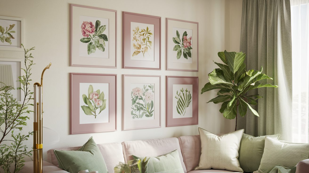
Swap 1: A Botanical or Floral Print
This is your hero print for spring. Botanical and floral art is everywhere right now — think pressed flower illustrations, eucalyptus watercolors, or a simple line-drawn peony. The goal is something organic that immediately reads as “spring” when you walk in the room.
For free options, Unsplash has gorgeous free botanical photography you can download and print. Fair warning though: Unsplash images download at screen resolution, not print resolution. The first time I tried this, I sized the image wrong and ordered an 8×10 that came out blurry and pixelated — total waste. I learned the hard way that you need to check that the image is at least 2400×3000 pixels before you order a print. Filter by highest-resolution images and zoom in before you commit.
For a more curated look, Etsy has stunning botanical printables in the $2–5 range, or check design blogs like Rifle Paper Co.’s blog for occasional free seasonal downloads with the highest print quality of any free source.
Swap 2: An Abstract in the Spring 2026 Palette
The spring 2026 color story is earthy and soft: creamy whites, muted mauves (think dried rose, not hot pink), and sage greens. Pantone’s direction this cycle leans toward grounded naturals — colors that feel like the earth waking up, not a candy store. An abstract print in these tones adds visual interest without competing with your botanical piece.
For this swap, Canva is your best friend. Their free templates include tons of abstract art designs you can customize to hit exactly the right color palette. The key trick: when you export from Canva, choose the “Print” download option (not standard download) — this exports at 300 DPI instead of 72 DPI, which is the difference between a crisp print and a muddy one.
Aim for muted tones over saturated ones. A blob of dusty mauve on cream linen looks intentional and elevated. A bright magenta blob looks like a mistake. Trust the muted palette — it photographs beautifully and holds up as trends shift.
Swap 3: A Typography or Quote Piece
A spring quote or simple word print gives your wall a “voice.” I go with something short and seasonal — “bloom where you’re planted,” or a simple botanical Latin name in elegant serif font. Keep it understated; the typography piece should feel like punctuation, not a billboard.
Canva absolutely shines here. Their font library is huge, and the typography/quote print templates are legitimately beautiful — you’re not going to look at it and think “Canva.” Export at 300 DPI using the Print setting, choose a cream or soft white background to tie into your spring palette, and you’re done. This print costs you exactly $0.
Free Spring Printable Sources: Quality Comparison
Not all free printables are created equal. Here’s what I’ve actually tested so you don’t end up with blurry prints or wasted ink:
Canva (Best for Typography and Abstract)
Canva’s free tier is remarkably powerful for printable art. Templates are easy to customize, the font library is excellent, and — crucially — you can export at true 300 DPI by selecting “Download → PDF Print” or “PNG → Print quality.” This is the single setting most people miss. Standard download gives you 72 DPI web resolution. Print download gives you 300 DPI. Same file, completely different result when printed at 8×10.
Canva is my first stop for typography prints and abstract color-field designs. For botanical photography, I go elsewhere.
Unsplash (Best for Botanical Photography — With Caution)
Unsplash’s botanical and floral photography is genuinely stunning — real photographers contributing real art for free. The catch: downloads are at screen resolution (typically 72 DPI), which isn’t sufficient for large prints unless the source image is very high-resolution. Before downloading, check the image dimensions. You need at least 2400×3000 pixels for a clean 8×10 print at 300 DPI. Many Unsplash images are large enough; many aren’t. Check first, download second.
Design Blogs and Rifle Paper Co. Style Sources (Highest Quality)
Design-forward blogs and brands like Rifle Paper Co. occasionally release free seasonal printables that are already formatted for print at correct resolution. These are the highest-quality free options available — they’re designed by actual graphic designers and formatted specifically for home printing. The limitation: seasonal selection is narrow, and free releases are infrequent. When they drop, grab them.
Printing Tips: FedEx Office vs. Staples vs. Home
For under $3, you can get a professional-quality 8×10 print at FedEx Office or Staples. The difference from home printing is real — FedEx’s matte prints have a crisp, almost velvety finish that makes botanical photography look gallery-worthy. My home inkjet tends to oversaturate the greens and lose the subtlety of muted mauves. If you’re going for the Swap 2 abstract or Swap 1 botanical, I’d spend the $1–3 at FedEx and get it done right. For the typography print (Swap 3), home printing is totally fine since it’s mostly black ink on white.
Both FedEx Office and Staples accept standard file uploads online — upload your PDF or high-res PNG, choose matte finish, pick up same-day. Spring refresh in 20 minutes.
Step-by-Step: How to Execute Your Spring Gallery Wall Swap
Step 1: Identify Your Anchor Pieces vs. Swap Pieces
Stand back and look at your wall. Anchor pieces are anything that’s hard to replace — family photos, large-format art, statement prints with emotional significance, or pieces that define the overall composition. These stay. Swap pieces are smaller, more generic art that’s doing a supporting role: filler prints, decorative quotes, stock photography you downloaded years ago. These are your targets.
You’re looking for 3 swap positions, ideally spread across the wall for visual balance. If all three happen to be clustered in one corner, that corner will feel updated but the rest of the wall won’t. Spread them out — one upper area, one center, one lower or side.
For the full strategy on building a gallery wall that’s designed for seasonal swaps from the start, read our Gallery Wall on a Budget guide — it covers the anchor/swap framework in depth.
Step 2: Match Your New Prints to the Spring 2026 Palette
Your three new prints should share at least two palette elements: earthy cream, muted mauve, and/or soft sage green. They don’t need to be identical in color — in fact, slight variation is what makes a curated wall feel like a collection rather than a kit. But they should feel like they belong to the same family.
A helpful Pinterest trick: search “spring 2026 gallery wall palette” and look at the color swatches in the saves. You’ll immediately get a feel for the temperature of the palette — warm and earthy, not bright and saturated. Then bring that reference when you’re customizing in Canva or filtering on Unsplash.
Step 3: The Frame Color Hack That Changes Everything
Here’s the unexpected finding from my testing: the frame color matters more than the print itself. I swapped a print and hated the result — the new spring botanical looked wrong in the old dark walnut frame. The moment I gave the frame a fresh coat of Rust-Oleum Chalked spray paint in “Aged Gray,” the whole thing clicked. The print hadn’t changed. The frame had. The wall looked completely different.
I tested this on a $4 IKEA TOLSBY frame and a Dollar Tree frame side by side. The Dollar Tree frame absorbed the chalked paint beautifully — honestly looked more expensive than the IKEA piece after painting. A single can of Rust-Oleum Chalked in “Aged Gray” or “Linen White” costs $6–8 and covers multiple frames. It’s genuinely transformative for $8.
You don’t need to repaint all your frames — just one. Paint the frame around your Swap 2 abstract piece, since that’s usually the most visually prominent of the three. One updated frame creates a “new accent” that makes the whole wall feel refreshed. This works with any frame you already own: IKEA RIBBA, Target Room Essentials, Walmart Mainstays — they all take spray paint beautifully with a light sand and clean wipe first.
Step 4: Rehang with Better Hardware
While your frames are down, do a quick hanging hardware audit. Command Strips are the most popular choice, and they work fine for lighter frames (under 4 lbs). The 3M Picture Hanging Strips (different product — the interlocking plastic ones) hold heavier frames more securely and come apart cleanly when you want to swap again next season without taking paint off the wall.
My preference for seasonal swap frames: 3M Picture Hanging Strips in the medium size. They hold up to 16 lbs per pair, release cleanly when you press the tab, and you can buy them at Target, Walmart, or Amazon. Command Strips work too but occasionally leave adhesive residue when removed — not ideal for a wall you’re refreshing twice a year.
Your Spring 2026 Gallery Wall Entity Checklist
Everything you need, in one place:
- Free art sources: Canva (300 DPI export via Print setting), Unsplash (check resolution ≥2400x3000px), Rifle Paper Co. blog, Etsy for $2–5 premium printables
- Printing: FedEx Office (~$1–3 for 8×10 matte), Staples (similar pricing), home printer fine for typography
- Budget frames: IKEA RIBBA, Target Room Essentials, Dollar Tree frames, Walmart Mainstays
- Frame paint: Rust-Oleum Chalked in “Aged Gray” or “Linen White” ($6–8/can)
- Hanging hardware: 3M Picture Hanging Strips (seasonal swap recommended), Command Strips
- Palette reference: Pantone spring 2026 direction — earthy creams, muted mauves, soft greens
- Inspiration: Pinterest boards tagged “spring gallery wall 2026,” Rifle Paper Co. seasonal content
Real Talk: What I Got Wrong (And What Surprised Me)
I made the Unsplash resolution mistake on my first attempt — downloaded a gorgeous fern photograph, uploaded to FedEx, and got an 8×10 that looked like a watercolor rendering of a fern rather than a photograph. The image was only 1200x900px. You need at least 2400x3000px for a clean 8×10 at 300 DPI. Now I always check dimensions in the Unsplash download dialog before committing.
The surprise: frame color is genuinely more important than the print. I spent an afternoon testing different prints in the same frame and vice versa. The frame color determined whether something felt cohesive or off. A crisp white Linen White chalked frame makes botanical prints look editorial. The same print in an old brass frame looks dated. Same print. Different frame. Completely different result. That $6–8 can of Rust-Oleum is the highest-ROI item on this list.
Frequently Asked Questions
How to update gallery wall for spring?
Use the 3-Swap Formula: identify 3 smaller “swap piece” positions across your gallery wall, replace them with seasonal botanical, abstract, and typography prints in spring’s earthy cream and muted mauve-green palette. Use existing frames or repaint one with Rust-Oleum Chalked spray paint for under $8 total.
Best free spring printable wall art?
Canva is best for typography and abstract prints — export at 300 DPI using the Print download setting. Unsplash offers free botanical photography; check that images are at least 2400x3000px before printing. Design blogs like Rifle Paper Co. occasionally release high-quality free seasonal printables. Etsy has affordable paid options starting at $2.
How many prints should I swap seasonally?
Three prints is the sweet spot — enough to shift the feel of the wall without disrupting the core composition. Swap one botanical, one abstract in the season’s palette, and one typography piece. Any fewer and the refresh feels minor; any more and you risk losing the cohesion that makes your permanent anchor pieces work.
What size prints work best for gallery walls?
4×6 and 5×7 prints work as accent pieces; 8×10 is the ideal standard swap size — large enough to be noticed, easy to print cheaply at FedEx or Staples for $1–3. For anchor positions, 11×14 or larger provides visual weight. Mix sizes for rhythm: don’t use all the same size, and don’t use wildly mismatched sizes without intentional spacing between them.
Leave a Reply