Last month, I walked into my friend Sarah’s apartment and stopped dead in my tracks. Her living room wall—previously a sad expanse of builder-grade beige—had transformed into this stunning gallery that looked like it belonged in a design magazine.
“Please tell me you didn’t spend a fortune on this,” I said, already calculating how I could replicate it.
She laughed. “Twenty-three dollars. Total.”
That conversation changed everything I thought I knew about wall art.
The Gallery Wall Revolution Nobody Talks About
Here’s what the home décor industry won’t tell you: most expensive wall art is overpriced printed material in fancy frames. The same digital files selling for $200 at West Elm? Often available as free downloads from talented designers who share their work online.
I’ve spent the last six months obsessively researching this world. Downloaded over 300 printables. Tested different printing methods. Made embarrassing mistakes (RIP to the gallery wall that looked like a Pinterest fail).
What I discovered will save you hundreds while creating something infinitely more personal than mass-produced art.
But first, let me address the elephant in the room.
Why Most Gallery Walls Look Amateur (And How to Avoid This)
Walk through any furniture showroom and you’ll notice something: their gallery walls look effortless. Visit most homes and the opposite is true.
The difference isn’t budget—it’s understanding three fundamental principles:
Scale relationships matter more than perfect alignment. Your eye craves variety in sizes, but the proportions need to feel intentional, not random.
Color temperature trumps exact color matching. Warm tones play together. Cool tones harmonize. Mixing temperatures without purpose creates visual chaos.
Negative space is your secret weapon. Empty wall around your grouping makes everything look more expensive and intentional.
I learned these lessons through trial and error. My first attempt violated all three rules simultaneously. The result? My husband diplomatically suggested we “might want to reconsider the spacing.”
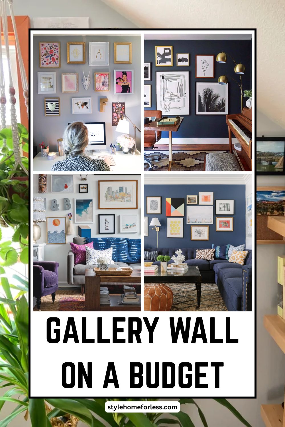
The 12 Gallery Wall Approaches That Actually Work
1. The Intentional Grid (Easiest to Execute)
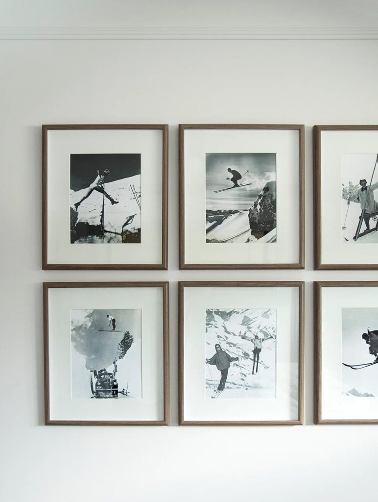
Best for: Beginners, minimalist spaces, perfectionists Skill level: Novice Time investment: 2-3 hours Average cost: $35-50
This isn’t your grandmother’s matching frame set. Modern grids use identical frames with carefully curated content that tells a cohesive story.
My testing results: Nine 8×10 frames arranged in a 3×3 grid works perfectly above a standard sofa. Anything larger overwhelms. Anything smaller looks insignificant.
Frame spacing formula: Measure your wall width, subtract total frame widths, divide remaining space by number of gaps. This gives you exact spacing measurements.
Content strategy: Choose a unifying element—all black and white photos, all botanical prints, all typography. The consistency creates sophistication.
Where to source frames: Dollar Tree’s 8×10 black frames ($1.25 each) look identical to Target’s $12 versions. I’ve tested them side-by-side.
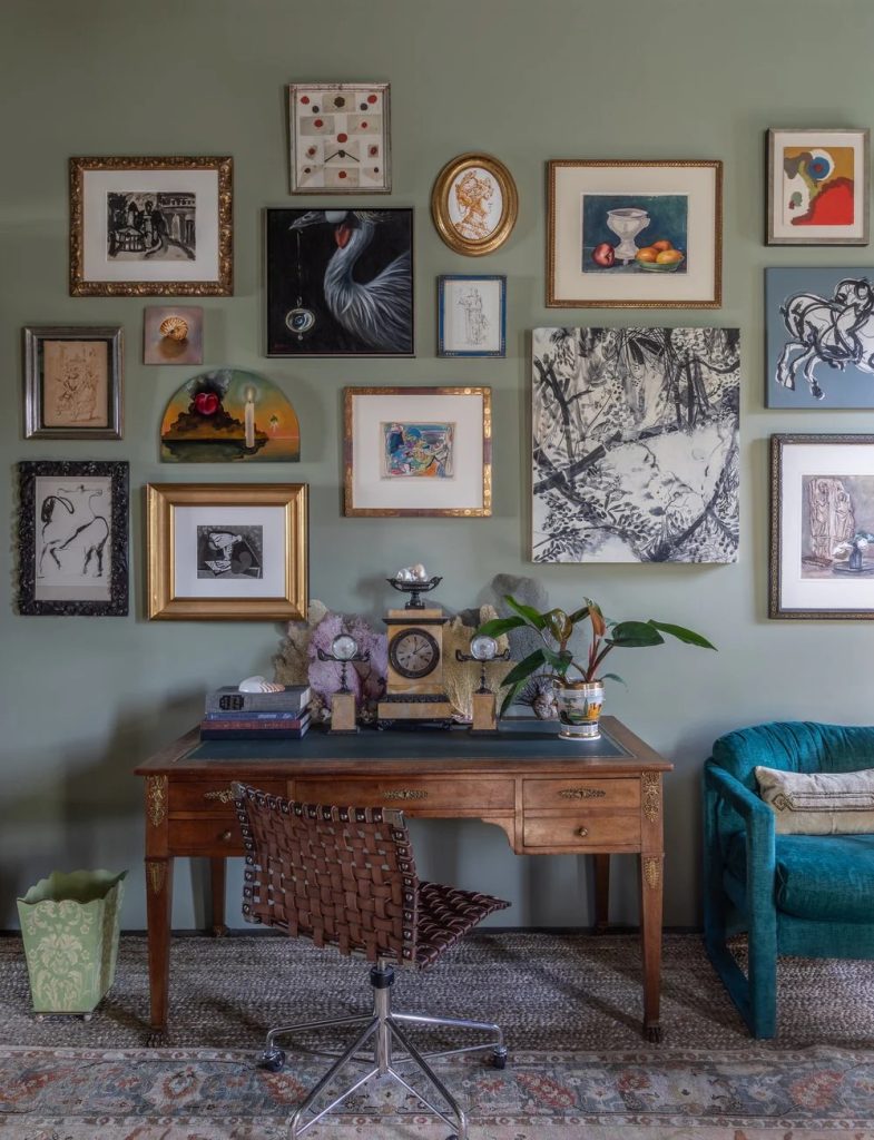
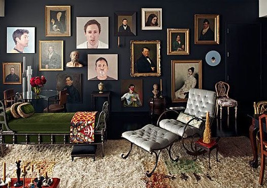
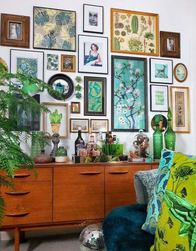
2. The Salon Wall (Maximum Visual Impact)
Best for: Bold personalities, large walls, eclectic décor lovers Skill level: Intermediate to advanced Time investment: 4-6 hours planning + hanging Average cost: $60-85
This approach embraces controlled chaos. Think European art salon meets modern home.
The critical mistake everyone makes: Starting with frames instead of content. Plan your visual story first, then select frames that support it.
My salon wall process:
- Cut paper templates for each frame size
- Arrange on floor first, photograph arrangements
- Transfer successful layout to wall using templates
- Hang largest pieces first, fill in with smaller ones
Professional proportion trick: Your largest piece should be roughly 1/3 of your total wall space. Everything else orbits around it.
Content mixing ratios: 40% photography, 30% illustrations/graphics, 20% typography, 10% mixed media. This creates visual rhythm without overwhelming any single element.
3. The Story Arc (Most Personal Impact)
Best for: Family spaces, memory keepers, sentimental decorators Skill level: Beginner to intermediate
Time investment: 3-4 hours Average cost: $45-65
Instead of random pretty pictures, this approach tells your family’s story chronologically or thematically.
My daughter’s room example: We created a timeline from baby photos to current artwork, interspersed with inspirational quotes about growing up. She requests story time about “her wall” regularly.
Adult applications: Career milestones, travel adventures, relationship journey, creative evolution. The narrative thread makes every piece meaningful.
Frame selection strategy: Use 2-3 frame styles maximum. Vary sizes within each style to create rhythm without chaos.
Content balance: 60% personal photos/memories, 40% supporting graphics/quotes that reinforce your theme.
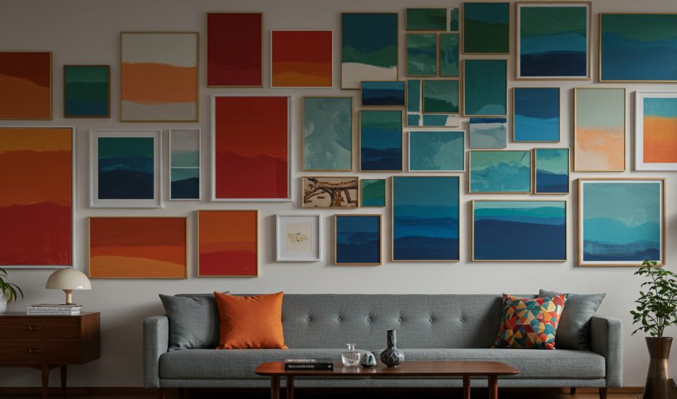
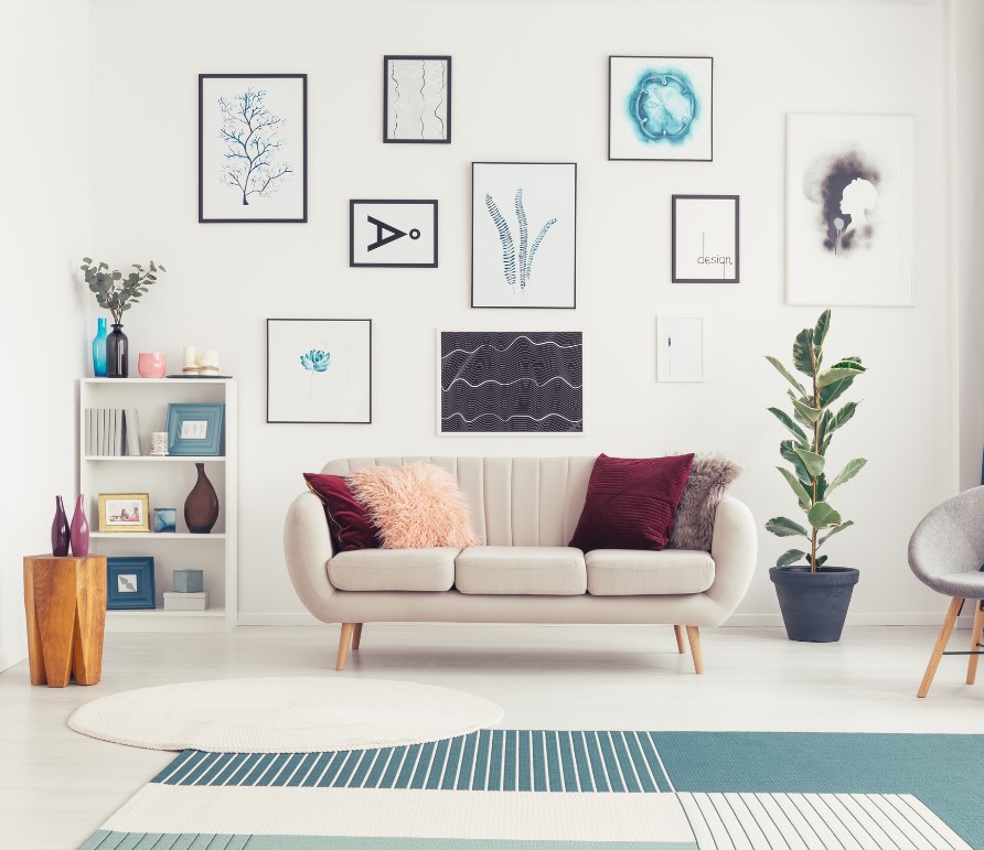
4. The Color Journey (Instagram-Worthy Results)
Best for: Modern spaces, color lovers, social media enthusiasts Skill level: Intermediate Time investment: 4-5 hours (including color planning) Average cost: $50-70
This technique arranges artwork by color progression, creating an ombré effect that photographs beautifully.
Color theory application: Start with your boldest hue, gradually transition through related tones, end with neutrals or complementary colors.
My kitchen success story: Transitioned from deep teal through aqua to cream, pulling colors from my backsplash tiles. Guests consistently photograph this wall.
Sourcing colored printables: Search specifically for “watercolor printables [color name]” or “abstract art [color palette].” Pinterest boards often curate by color family.
Frame coordination: White or natural wood frames let colors take center stage. Colored frames compete with your carefully planned progression.
5. The Typography Gallery (Words That Motivate)
Best for: Home offices, reading nooks, motivation seekers Skill level: Beginner Time investment: 2-3 hours Average cost: $30-45
Combining inspirational quotes, song lyrics, poetry, and meaningful phrases creates walls that speak to you—literally.
Font pairing principles: Pair serif with sans-serif, script with clean modern fonts. Limit yourself to three font families maximum to avoid the “ransom note” effect.
Content sourcing strategy: Mix famous quotes with personal mantras, song lyrics that move you, family mottos, or inside jokes. Personal relevance trumps universal appeal.
Size hierarchy: Feature one large quote as your anchor, surround with smaller supporting phrases. This creates visual focus while maintaining readability.
My home office reality: My typography wall includes everything from Maya Angelou quotes to lyrics from songs that got me through difficult times. It’s become my daily inspiration source.
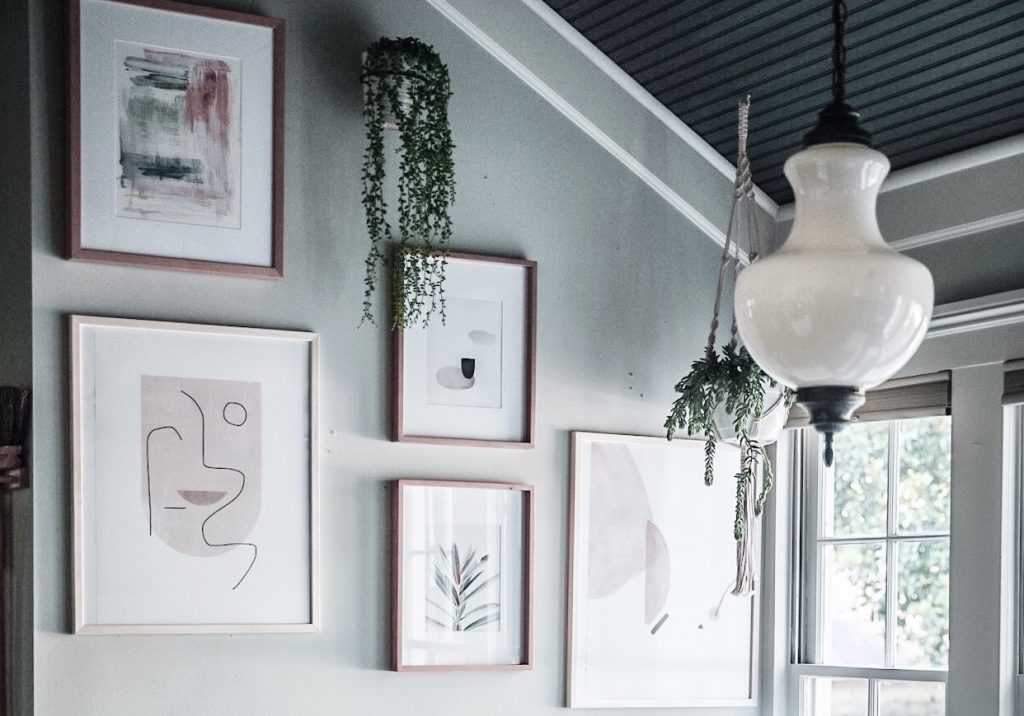
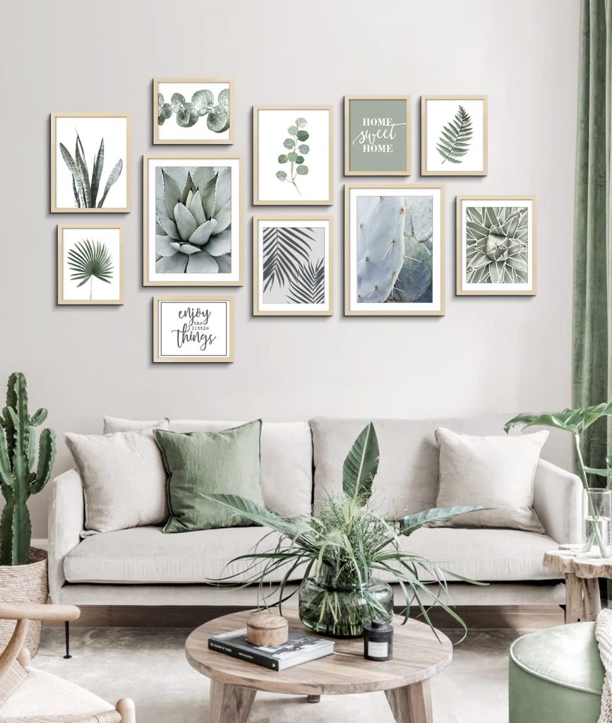
6. The Nature Sanctuary (Biophilic Design on a Budget)
Best for: Stress relief, small spaces, nature lovers without outdoor access Skill level: Beginner Time investment: 2-3 hours Average cost: $35-50
Botanical prints, landscape photography, and nature illustrations bring outdoors inside, creating calm, restorative environments.
Scientific backing: Studies show nature imagery reduces cortisol levels and improves focus. Your wall art can literally improve your wellbeing.
Content categories that work: Vintage botanical illustrations, macro photography of leaves/flowers, landscape photography, abstract interpretations of natural forms.
Seasonal adaptation: Swap spring flowers for autumn leaves, summer beaches for winter forests. Same frames, constantly evolving natural story.
My bedroom transformation: Created a “forest canopy” effect above our bed using various green-toned botanical prints. Sleep quality improved noticeably—probably psychological, but who cares if it works?
7. The Minimalist Statement (Less is More, Done Right)
Best for: Clean aesthetics, small spaces, decision-fatigued people Skill level: Beginner Time investment: 1-2 hours Average cost: $25-35
Three to five carefully chosen pieces create maximum impact with minimal commitment.
The power of odd numbers: Three or five pieces feel more natural than even numbers. Your brain prefers asymmetrical balance.
Spacing for impact: Generous white space around your grouping makes each piece feel more important and expensive.
Content selection criteria: Choose pieces with strong visual weight—bold colors, striking contrast, or compelling subjects that command attention.
My entryway success: Three large black and white photographs in matching frames create immediate impact without overwhelming the small space.
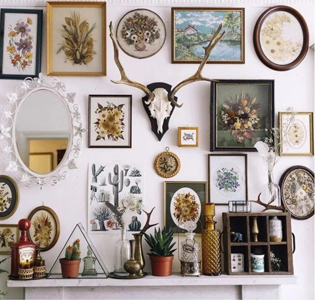
8. The Mixed Media Adventure (Beyond Traditional Prints)
Best for: Creative types, texture lovers, unique aesthetic seekers Skill level: Intermediate to advanced Time investment: 4-6 hours Average cost: $55-75
Combine printables with small shelves, mirrors, fabric art, or 3D elements for dimensional interest.
Balance principle: Let 2D artwork dominate numerically (70%) while 3D elements provide visual weight and interest (30%).
Integration ideas: Floating shelves for small plants, vintage cameras, meaningful objects; small mirrors to reflect light and add depth; fabric hoops with beautiful textiles; shadow boxes with collections.
My living room experiment: Combined botanical prints with floating shelves holding succulents and small pottery pieces. The living elements make the static art feel more dynamic.
9. The Budget Luxury Look (Expensive Appearance, Thrift Store Prices)
Best for: Sophisticated aesthetics, impressive guest spaces, maximizing perceived value Skill level: Intermediate Time investment: 3-4 hours plus shopping time Average cost: $40-60
Strategic frame selection and content curation create the illusion of expensive gallery-quality art.
Frame upgrade tactics: Gold spray paint transforms cheap frames into luxury looks. Distress edges slightly for vintage authenticity.
Content selection for luxury: Abstract art, architectural photography, vintage maps, fashion illustrations. Avoid obviously cute or craft-like imagery.
Matting magic: Adding mats (even simple white ones) instantly elevates any artwork. Cut your own using a ruler and craft knife for budget-friendly upgrading.
My dining room revelation: Ornate thrift store frames ($2-5 each) with carefully chosen abstract printables create a gallery that guests assume cost hundreds.
10. The Seasonal Rotation System (Year-Round Freshness)
Best for: Change enthusiasts, holiday lovers, renters who can’t paint Skill level: Beginner Time investment: 1 hour per seasonal change Average cost: $60-80 (one-time investment for multiple seasons)
Maintain the same frame arrangement while swapping artwork seasonally for constant visual refresh.
Organization system: Store seasonal prints in labeled folders or binders. Five-minute swaps create completely new room personalities.
Transition strategies: Keep 1-2 neutral pieces constant while changing 3-4 seasonal elements. This maintains visual anchor points while refreshing the overall feel.
My family room evolution: Spring brings cherry blossoms and fresh greens, summer adds beach and travel themes, fall introduces warm colors and harvest motifs, winter brings cozy elements and holiday touches.
Cost efficiency: Initial investment in frames and multiple print sets pays for itself compared to buying new décor each season.
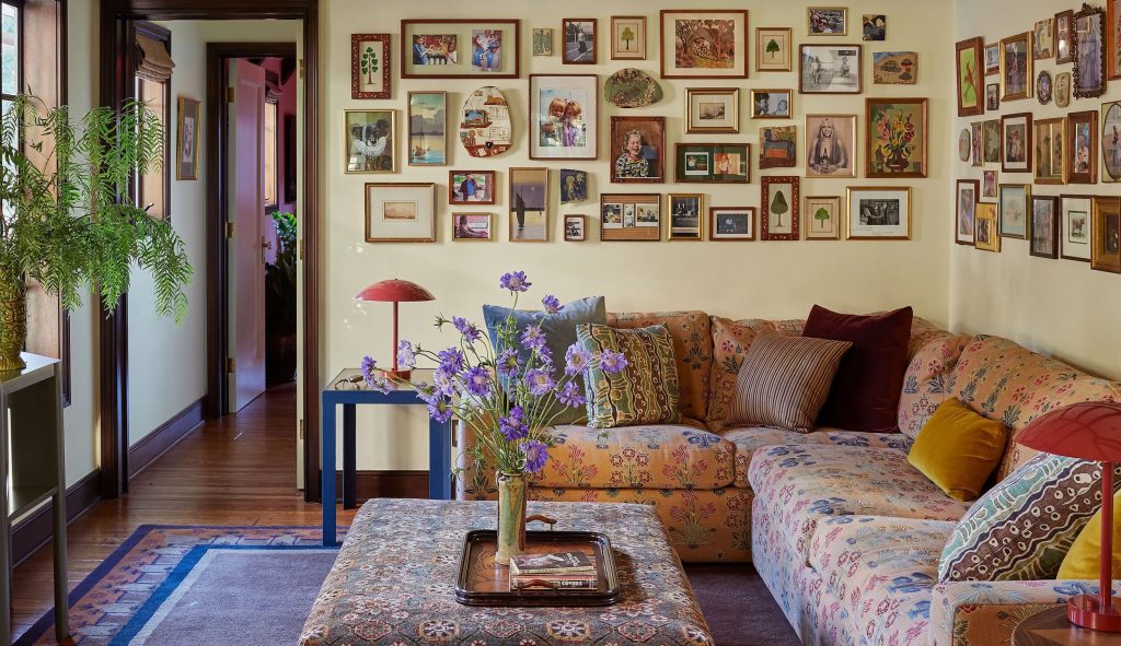
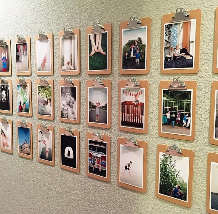
11. The Photography Documentary (Personal History on Display)
Best for: Memory keepers, family-focused homes, storytelling enthusiasts Skill level: Beginner to intermediate Time investment: 3-5 hours (including photo selection and editing) Average cost: $45-65
Transform family photographs into gallery-worthy displays through thoughtful curation and presentation.
Curation principles: Choose photos that tell a story rather than just documenting events. Look for emotion, composition, and narrative connection.
Technical improvements: Basic editing (brightness, contrast, saturation) transforms phone photos into print-worthy images. Free apps like Snapseed work perfectly.
Mix ratios for balance: 70% family photos, 30% supporting graphics (dates, quotes, maps of meaningful places) prevents the “family snapshot” look.
My hallway success: Combined travel photos with vintage maps of places we’ve visited and meaningful quotes about adventure. Guests always pause to study it.
12. The Flexible Growth System (Evolving with Your Life)

Best for: Renters, life transitioners, commitment-phobes Skill level: Beginner Time investment: 2-3 hours initially, minimal for additions Average cost: $35-50 initial, $5-10 per addition
Start small and add pieces over time, allowing your gallery wall to grow organically with your life and interests.
Foundation strategy: Begin with 3-5 pieces that establish your style and color palette. Add new elements monthly or as inspiration strikes.
Expansion guidelines: Maintain visual balance by adding pieces that complement existing colors and themes while introducing new elements gradually.
My personal journey: Started with three botanical prints in my bedroom. Two years later, it’s expanded to include family photos, travel memories, and inspirational quotes that reflect my evolving interests.
The Technical Mastery Section (Getting Professional Results)
Printing Like a Pro (Without Pro Costs)
Home printing capabilities: Modern inkjet printers handle up to 11×14 beautifully on photo paper. I’ve been shocked by my basic Canon’s output quality.
Paper selection impact:
- Matte finish: Perfect for vintage illustrations, watercolors, rustic aesthetics
- Glossy: Best for photography, modern graphics, vibrant colors
- Textured/canvas: Adds sophisticated feel to any artwork
Commercial printing strategy: For sizes 16×20 and larger, professional printing becomes cost-effective. Costco offers exceptional quality at reasonable prices—a 20×30 canvas print costs around $15.
Color accuracy tips: Calibrate your monitor or expect slight color variations. Test print small sections of critical pieces before committing to large formats.
Frame Selection Mastery
Budget frame sourcing hierarchy:
- Dollar stores: Basic sizes in standard colors ($1-3)
- Thrift stores: Unique character pieces, perfect for eclectic looks ($2-8)
- IKEA: Quality basics in multiple sizes, worth the investment for matching sets ($3-15)
- Target clearance: End-of-season markdowns offer premium frames at budget prices ($5-20)
Frame modification techniques:
- Spray painting: Transform any frame into custom colors
- Distressing: Sandpaper creates vintage character
- Mat additions: DIY matting using craft store supplies elevates any artwork
Size planning strategy: Measure your wall space and map out proportions before buying frames. The 2/3 rule (your gallery should cover 2/3 of available wall space) prevents scaling mistakes.
Installation Without Tears
Planning tools that actually help:
- Paper templates: Cut out frame sizes and arrange on wall before committing to holes
- Smartphone apps: “Hang My Picture” calculates exact measurements and spacing
- Painter’s tape: Mark frame positions temporarily for visualization
Hanging hardware hierarchy:
- Command strips: Perfect for renters, surprisingly strong for lightweight frames
- Picture wire and nails: Traditional method for permanent installations
- Sawtooth hangers: Easy installation but less adjustable
- French cleats: Professional method for heavy pieces
The 57-inch rule: Center your gallery grouping at 57 inches from floor to center of artwork. This museum standard works in most residential settings.
Spacing mathematics: 2-3 inches between frames feels professionally spaced. Closer looks cramped, wider appears disconnected.
Avoiding the Expensive Mistakes I Made
Common Planning Errors
Mistake #1: Shopping frames before planning content I once bought twelve identical frames only to discover my content needed varying sizes. Now I plan content first, then select frames that serve the art.
Mistake #2: Ignoring room proportions A gallery wall that looks perfect in your head might overwhelm or underwhelm your actual space. Always use paper templates to test scale.
Mistake #3: Perfect symmetry obsession My most rigid grid arrangement felt sterile and boring. Slight imperfections create personality and visual interest.
Content Selection Pitfalls
Generic inspirational quotes feel impersonal. Choose words that specifically resonate with your life experience.
All similar subjects create monotony. Mix content types—photography, illustrations, typography—for visual variety.
Ignoring your existing décor colors results in gallery walls that feel disconnected from the rest of your space.
Installation Disasters I’ve Survived
Measuring once, hanging twice (or more). I’ve patched more nail holes than I care to admit. Templates and careful measurement prevent this heartbreak.
Command strip weight limits are real. Test your setup on less visible walls before committing to your main display area.
Fighting your wall texture instead of working with it. Textured walls need different approaches than smooth drywall.
Real Budget Breakdowns (Actual Numbers from My Projects)
Project 1: Living Room Salon Wall (15 pieces)
- Frames: $67 (mix of thrift store and Dollar Tree finds)
- Printing: $31 (various sizes at Costco and local print shop)
- Hanging supplies: $12 (Command strips and picture wire)
- Time investment: 8 hours over three weekends
- Total cost: $110
- Comparable retail value: $800-1200
Project 2: Bedroom Botanical Grid (9 pieces)
- Frames: $28 (IKEA RIBBA frames)
- Printing: $18 (8×10 prints at Costco)
- Matting: $15 (DIY using craft store supplies)
- Hanging supplies: $8 (picture hanging kit)
- Total cost: $69
- Comparable retail value: $400-600
Project 3: Kitchen Color Journey (7 pieces)
- Frames: $45 (Target clearance white frames)
- Printing: $22 (various sizes)
- Hanging supplies: $6 (Command strips)
- Total cost: $73
- Comparable retail value: $350-500
The Free Printable Goldmine (Where to Find Quality Content)
Premium Free Sources
Unsplash and Pexels: High-resolution photography perfect for modern gallery walls. Search by color, subject, or mood.
The Graphics Fairy: Vintage illustrations, botanical prints, and antique graphics. Perfect for farmhouse or vintage aesthetics.
Design Love Fest: Modern, colorful printables with sophisticated design sensibility.
Oh My Creative: Seasonal collections and themed printable sets updated regularly.
Creating Your Own Printables
Canva Pro tips: Use their vast library of elements to create custom designs. Typography combinations, abstract shapes, and photo effects make unique artwork.
Photography printing: Your own travel photos, nature shots, or artistic experiments can become gallery-worthy prints with basic editing.
Quote customization: Transform meaningful quotes into beautiful typography using free design tools.
Licensing and Usage Rights
Always check usage rights. Most free printables allow personal use but prohibit commercial applications.
Attribution when required. Some designers request credit—a small price for beautiful free artwork.
Quality varies significantly. Download full-resolution versions and check print quality on test pieces before committing to large formats.
Seasonal Strategy for Year-Round Appeal
Spring Refresh (March-May)
Color palette: Fresh greens, soft pinks, bright yellows Themes: Botanical growth, renewal, outdoor activities Content ideas: Flower photography, garden illustrations, growth quotes
Summer Energy (June-August)
Color palette: Ocean blues, sandy beiges, sunset oranges Themes: Travel, adventure, relaxation, outdoor living Content ideas: Landscape photography, travel quotes, beach scenes
Autumn Warmth (September-November)
Color palette: Rust oranges, deep reds, golden yellows Themes: Harvest, gratitude, cozy comfort, preparation Content ideas: Fall foliage, harvest imagery, thankfulness quotes
Winter Comfort (December-February)
Color palette: Deep blues, crisp whites, metallic accents Themes: Reflection, peace, family, celebration Content ideas: Winter landscapes, cozy imagery, inspirational reflections
Advanced Techniques for Gallery Wall Masters
Creating Visual Weight Balance
Not all artwork carries equal visual weight. Dark colors, busy patterns, and large sizes command more attention than light, simple, or small pieces. Balance heavy pieces with lighter ones across your arrangement.
Color Temperature Harmony
Warm colors (reds, oranges, yellows) work together beautifully. Cool colors (blues, greens, purples) create different but equally harmonious groupings. Mixing temperatures without purpose creates visual tension.
Texture and Pattern Mixing
Combine smooth photography with textured illustrations, simple graphics with detailed patterns, solid colors with complex imagery. This variety creates visual interest without chaos.
Lighting Considerations
Gallery walls look dramatically different under various lighting conditions. Test your arrangement during different times of day and consider adding picture lights or accent lighting for evening enhancement.
Troubleshooting Common Problems
“My Gallery Wall Looks Too Busy”
Solution: Increase negative space between pieces, reduce the number of different colors, or simplify frame selection to create visual calm.
“Everything Looks Too Small”
Solution: Add larger anchor pieces or increase the overall footprint of your arrangement. Small pieces scattered across a large wall disappear.
“The Colors Don’t Work Together”
Solution: Introduce neutral pieces as visual breaks between competing colors, or commit to a more limited color palette for harmony.
“It Looks Too Perfect/Boring”
Solution: Introduce slight imperfections—vary spacing slightly, mix frame styles, or add unexpected content that breaks your established pattern.
Making It Uniquely Yours
The difference between a good gallery wall and an unforgettable one? Personal connection.
Include pieces that tell your story—the quote that changed your perspective, the photo from your best vacation, the artwork your child created. These meaningful elements transform decoration into personal expression.
My favorite gallery wall includes a crayon drawing my daughter made at age four, professionally printed and framed alongside sophisticated botanical prints. Guests always notice it first, and it never fails to make me smile.
The Long-Term View
Gallery walls aren’t permanent installations—they’re living displays that evolve with your life. Start with pieces you love now, knowing you can add, subtract, and modify as your tastes and circumstances change.
The frames are your infrastructure investment. The artwork is flexible, replaceable, and constantly updatable. This mindset takes pressure off achieving perfection immediately while building something that grows with you.
If you’re just getting started decorating on a budget, our thrift store living room makeover guide pairs beautifully with a gallery wall project — thrift stores are also prime hunting grounds for the mix of frames that make these walls sing. And don’t miss our budget room makeover guide under $200 for a full-room transformation strategy.
Your Next Steps
Choose one approach from this guide that resonates with your space and style. Start with 3-5 pieces to test your concept before committing to a full wall.
Remember: the best gallery wall is the one that makes you happy every time you see it. Everything else—perfect spacing, color coordination, professional photography—is just supporting details.
My walls have become daily sources of inspiration, conversation starters with guests, and evolving records of what matters to me. They’ve cost a fraction of store-bought alternatives while delivering infinitely more personal satisfaction.
The printable art revolution has democratized beautiful wall décor. Your walls don’t have to stay blank because your budget is tight. They just need your creativity, some planning, and willingness to experiment.
Ready to transform your walls? Start browsing free printables tonight and imagine how they’d look in your space. Your perfect gallery wall is just a few downloads and frames away.
Save this guide and share your gallery wall creations with us @StyleHomeForLess—we celebrate every beautiful budget transformation!
Frequently Asked Questions
Where can I find free printables for a gallery wall?
The best sources for high-quality free printables are Unsplash (for photography), Creative Market’s free section (updated weekly), Canva’s free templates, and Pinterest boards that aggregate printable art links. Search terms like “free printable wall art 8×10” or “free botanical printable” will surface hundreds of options. Always check the license — most are free for personal use but not for resale or commercial projects.
What’s the cheapest way to frame printables for a gallery wall?
IKEA’s RIBBA and RÖDALM frames are the benchmark for cheap-but-decent quality, especially in the popular 8×10 and 5×7 sizes. Beyond that, thrift stores regularly carry frames for $0.50–$3 each — spray paint them all the same color for a cohesive look. Dollar Tree also carries basic plastic frames that photograph surprisingly well. The secret is consistent mat width and color: even mismatched frames look intentional when they share the same mat treatment.
How do I arrange a gallery wall without making lots of nail holes?
The paper template method is the best low-damage approach: trace each frame on kraft paper or grocery bags, cut them out, tape the templates to the wall with painter’s tape, and rearrange until the layout feels right — then nail through the paper. Command Picture Hanging Strips are a viable alternative for lighter frames (under 4 lbs each) and leave no holes at all, making them ideal for renters or anyone who changes their mind frequently.
Leave a Reply